Antarika Brand guidelines
These guidelines are created to help maintain a consistent and recognisable identity across every Antarika touchpoint. They bring together the key elements of the brand, including the logo, typography, colours and other visual assets, along with guidance on how they should be used.
Following these guidelines ensures that Antarika is represented consistently across different platforms, formats, and applications, while allowing the identity to remain flexible and expressive. They should be used as a reference whenever the brand is being presented, adapted, or applied to new materials.
Individual brand assets, can be downloaded below for easy access and future reference.
Logo
A photograph holds more than what is visible within its frame. A single moment can contain emotions, gestures, relationships, quiet actions, and fleeting details, all happening at once.
The Antarika logo draws from this idea. The symbol is formed by a group of frames, slightly offset and brought together to create one unified form. Each frame represents a different moment or perspective, while their composition reflects how individual moments come together to form a larger story.
The movement within the mark also suggests the passing of time and the way moments naturally unfold. It is not about capturing just one instant, but about observing what exists around it and finding meaning in the details.
The logo reflects Antarika’s approach to photography: looking beyond the obvious, noticing the moments within the moment, and bringing them together to tell a complete story.
Icon
Wordmark
Vertical Logo
Horizontal logo
-
The icon is the most simplified expression of the Antarika identity. It can be used independently where space is limited or where the brand is already recognisable.
Use for: Social media profiles, favicons, stamps, watermarks, app icons, and small-format applications.
-
The wordmark presents the Antarika name as the primary brand signature. It works well when the brand name needs to be clearly visible while keeping the identity minimal.
Use for: Photography credits, documents, social media, website headers, and applications where the full logo is unnecessary.
-
The vertical logo combines the icon and wordmark in a compact, stacked composition. It creates a stronger brand presence while remaining balanced and easy to recognise.
Use for: Cover pages, packaging, posters, social media creatives, signage, and square or portrait-oriented layouts.
-
The horizontal logo combines the icon and wordmark in a wider composition, making it ideal for spaces where vertical arrangements are restricted.
Use for: Website headers, email signatures, documents, presentations, horizontal signage, and other wide-format applications.
Colours
Intimate · Emotional · Sophisticated
A deep, expressive palette rooted in emotion and intimacy. Crushed Berry brings a sense of warmth and depth, reflecting the quieter side of photography where fleeting gestures, relationships, and unspoken emotions become the story. Soft rose and warm neutrals balance the richness of the primary colour, creating an identity that feels personal, timeless, and deeply human.
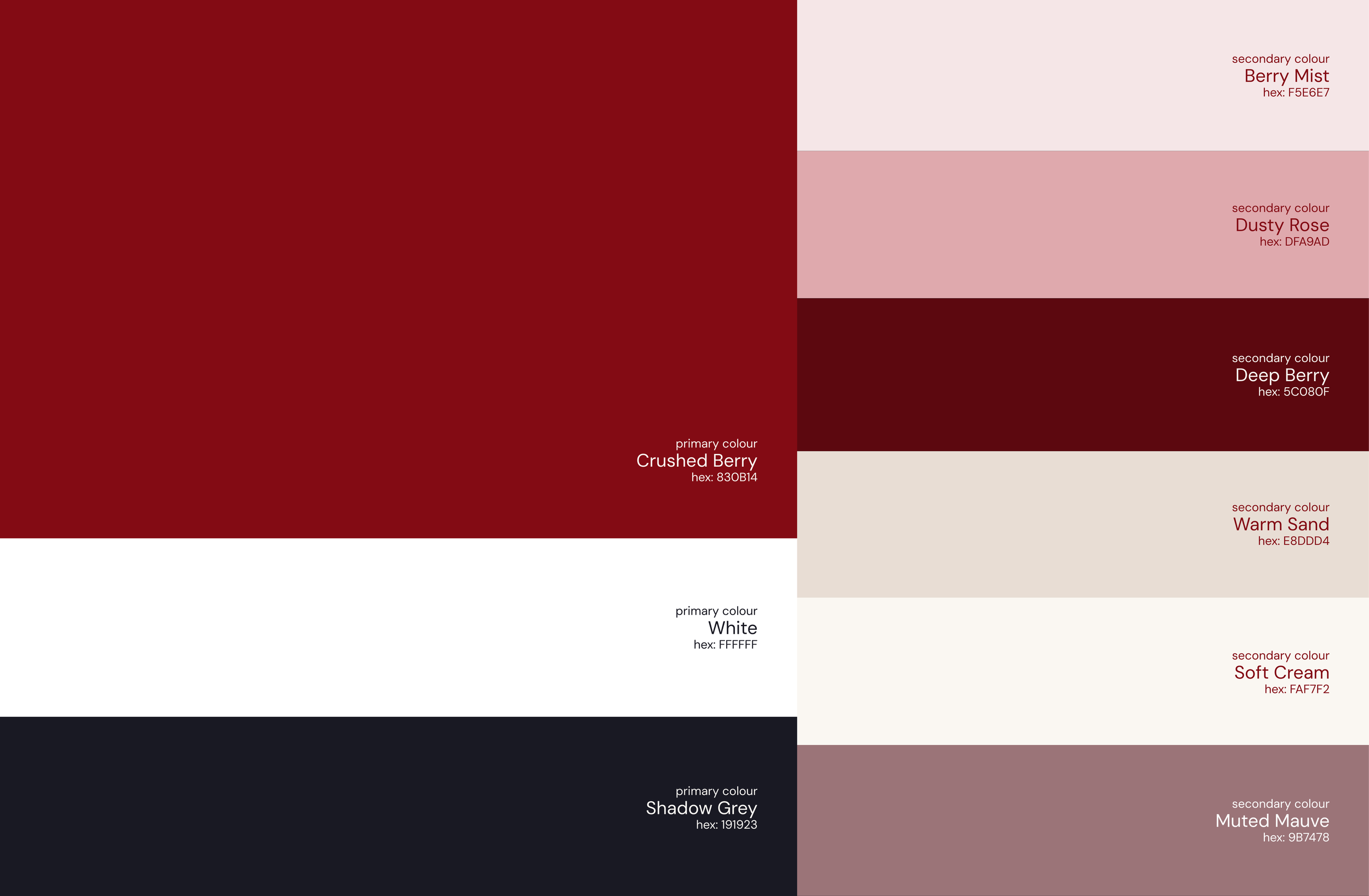
-
The primary colours establish the core visual identity of Antarika. They are the most recognisable colours within the system and create a strong, consistent presence across brand touchpoints. Their use should remain intentional so they continue to feel distinctive and connected to the overall identity.
Uses: Logo, wordmark, headings, primary buttons, key statements, important graphic elements, and high-visibility brand applications.
-
The secondary colours complement and extend the primary palette, bringing more flexibility and visual variation to the identity. They help create softer moments, contrast, and hierarchy while ensuring the primary colours remain the strongest visual anchors.
Uses
Backgrounds, cards, sections, secondary buttons, highlights, supporting text, borders, UI elements, and subtle graphic accents.
Fonts
The typography system for Antarika is built around a simple balance between character and clarity. Tenor Sans brings elegance and personality to titles and headings, while DM Sans keeps body text clean, comfortable, and easy to read. Together, they create a visual language that feels refined, warm, and understated, supporting Antarika’s overall identity without taking attention away from the imagery and stories.
-
Tenor Sans is the primary typeface for Antarika, used across the logo, titles, and headings. Its refined and elegant character gives the identity a distinctive presence while keeping the overall expression quiet and understated. It adds warmth, sophistication, and personality to the brand.
-
DM Sans is the secondary typeface, used primarily for body copy, supporting information, and longer-form content. Its clean and highly legible design keeps communication simple and easy to read across different formats. Paired with Tenor Sans, it creates a balanced typographic system that feels contemporary, clear, and approachable.
Downloads
Access and download the Antarika brand assets below for use across different applications and touchpoints. These files include the essential elements of the visual identity, prepared in the appropriate formats for easy use.